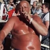
jandtaa Posted July 2, 2009 Share Posted July 2, 2009 Hi Folks Had a long delay flying out from Bangkok a couple of months ago and decided to look out for some high contrast shots to mess about converting to B&W these were my favourites. Shot on an old compact and converted in Lightroom. Want to try and develop my technique (looking for a strong graphic style but trying not to overcook them ) interested in any thoughts, suggestions you guys might have. cheers J Workmen repairing revolving door. Taxi Queue Link to comment Share on other sites More sharing options...
The Vulcan Posted July 3, 2009 Share Posted July 3, 2009 The first one is superb. A great shot and perfect in B+W. Not so keen on the second as it's a little to "heavy" for my taste. But the first one - WOW Link to comment Share on other sites More sharing options...
Who, me ? Posted July 3, 2009 Share Posted July 3, 2009 First one is really great....Keep them coming Link to comment Share on other sites More sharing options...
bonobo Posted July 14, 2009 Share Posted July 14, 2009 I agree with the Vulcan and Who, me? The first one is really, really good. Link to comment Share on other sites More sharing options...
Tywais Posted July 14, 2009 Share Posted July 14, 2009 Also agree, 1st one great. The 2nd one is too "busy". I think black & white requires simplicity to work well. Link to comment Share on other sites More sharing options...
lifeincnx Posted July 14, 2009 Share Posted July 14, 2009 The first image is exceptional. It shows wonderful composition, perfect exposure for a backlit scene and strong, thoughtful imagery. The second shot of the taxi queue is far too overdone in the contrast area and has overblown highlights in my opinion. However it is always a matter of taste and some may like the gritty, grundge effect here. Great work and this seems a creative path you should further explore. Link to comment Share on other sites More sharing options...
Tingnongnoi Posted July 14, 2009 Share Posted July 14, 2009 agree first one is excellent, 2nd a little too busy Link to comment Share on other sites More sharing options...
astral Posted July 14, 2009 Share Posted July 14, 2009 First great........ Second, might have been better in colour, too busy for B&W I hope you made the flight? Link to comment Share on other sites More sharing options...
lordsux Posted July 14, 2009 Share Posted July 14, 2009 The first image is great, 'Enter at you own risk' would be an apt title. Link to comment Share on other sites More sharing options...
phetaroi Posted September 27, 2009 Share Posted September 27, 2009 I'm rarely a fan of B&W, but I do like the first one. The second one, not clear what the point is. Link to comment Share on other sites More sharing options...
yumidesign Posted October 7, 2009 Share Posted October 7, 2009 (edited) comparisons are odious, but O M G i agree with vulcan the first one has all the votes Edited October 16, 2009 by Kan Win Link to comment Share on other sites More sharing options...
.png.3b3332cc2256ad0edbc2fe9404feeef0.png)


Recommended Posts
Create an account or sign in to comment
You need to be a member in order to leave a comment
Create an account
Sign up for a new account in our community. It's easy!
Register a new accountSign in
Already have an account? Sign in here.
Sign In Now