
GammaGlobulin
-
Posts
15,206 -
Joined
-
Last visited
-
Days Won
1
Content Type
Events
Forums
Downloads
Quizzes
Gallery
Blogs
Everything posted by GammaGlobulin
-
 Speaking of runaway immigration policies.... I have been astounded at seeing what is happening in the UK, as well. Some British cities are already resembling a bazaar in Calcutta... Oh, the irony of it all. The British Empire was once tops at colonizing other countries, and now England is being colonized itself at even a more rapid rate. And EVEN MORE ironical is the fact that the UK Gov is actually paying for it. The question is: Is this a planned strategy, over the past 20 years, to import labor? For sure, the USA and the UK will benefit from increased population, as their white population continues to dwindle. Significant immigration is indispensable. The only question is how it's done. Personally, I would like to just rely on the importation of ONLY the Chinese to both America and the UK. I prefer the Chinese culture to all others, and especially find it superior to the Calcuttan Culture you see here. As it is, at least for me, I think there is really no need to visit the UK, especially when India and Pakistan are so much closer to Thailand. Kaek Food Culture is fine with me, though. Soon, we can refer to Great Britain as Little India, and be accurate.
-
I think White is still better than Dark mode. The only thing I am trying to figure out is why there is so much empty space on the right and left of the text part. It's like those early maps of the world... The known world. And the BEYOND world where it was just left blank. Still, thankfully, we have this orange box with arrow pointing to heaven. So, this is good. I am just trying to figure out what I can add on the right and left,... Maybe pictures of my GFs...would me nice. ((I have no doubt that this is NOT the final iteration of the design. Things like this proceed forward and upwards in jumps and starts...It's always this way with computer software and design.... So, I am waiting to see what will happen next....)) This is just a Benq 29 inch screen view. At least I think it is 29 inch. I might have to check that.... But, with the 29 inch...there's tons of empty space for my GFs photos, and those of my dog, too,,,one and the same..maybe...
-
I SAID........ Oh... Nevermind.
-
Please calm down, JT...because.... If you begin ramping up your emotions, too early...and... With over 5 days to go.... Well, .... You know what might happen. Keep calm. Jai-Yan-Yan....
-
This does not bother me because.... On the Main Line.... Puerto Ricans were never seen as a potent political force.
-
And I thought JT was going to choose for his Topic-headline: "Epstein -- Trump connection. No smoking gun but definitely hot members" By the way, JT... How's your member, this election eve?
-
Very few do. No worries.
-
Sorry. I thought I was typing Rogue Asteroid. Did I type the color Rogue, instead?
-
Not to mention... Full-Body tats....
-
Well... I just hope that you realize that I am not posting here.... SOLELY, for your pleasure. Sure, sometimes I might reply to your posts. But, you cannot expect that I might reply to your posts.... OFTEN. Right?
-
No. I do not wear what you suggest: Around the house, I wear a towel, at most. This is why my phone is always.... In some other room. This is the problem. If I wore clothes, then..... Problem solved, I guess.
-
Yes. It does work well.
-
Seems everyone here is getting OVERHEATED...but... For the wrong reason. It's just an election. Life will go on....(with Trump, of course). If people would just put this much energy into addressing REAL problems.... Such as Global Warming.... Nuclear Proliferation.... Pandemics.... And, the possibility of a catastrophic HIT by a rouge asteroid.... Then, the world would be a better place.
-
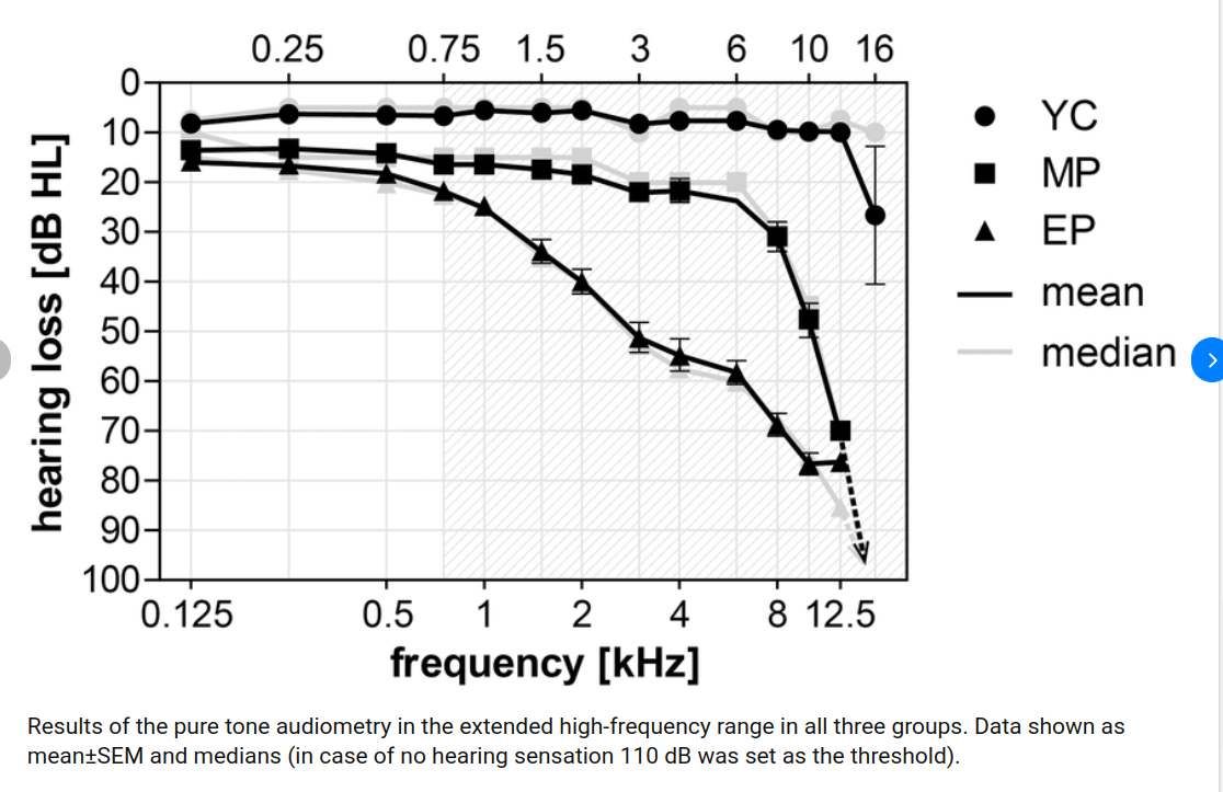
Have you had your hearing checked lately? The reason I ask is that .....
-
Also, keep this kind of data in mind. For average humans.... Check other studies, as well. If you want to make sense of this second graph, then you might go here: https://www.biorxiv.org/content/10.1101/2020.09.03.281717v1.full YC is the Young Control group.... The point is that high-frequency sensitivity plummets like a stone....compared to the control group.
-
Two weeks ago... I did not know Joe from Adam. So, maybe I WOULD be surprised.
-
OK. And, JT, if it were up to me...then.... I would gladly cause the numbers to go Harris's way.... But.... ONLY for YOU..... I do not care. So, my advice to you is to let sleeping dogs lie, meaning both candidates. Totally unhealthy to get so very wound up over a dumb USA election. Or, do what you like.
-
Too late. The election is already in the bag. Trump is the winner.... By a landslide.
-
Thank you. Very helpful suggestion. I have found that the Modern Office on Old Telephone Ringtones, might be best for those requiring a ringtone that can be more easily heard on "the other side of the house". Actually, although nobody here seems to believe me, the problem is actually not hearing-loss related. One other point to consider: With age-related hearing loss, it is often the case that one looses high-frequency sensitivity first. And, if this is the case, then, perhaps, a ringtone with lower frequencies might work better. Testing is is always best. One might also keep in mind that low-frequency sound penetrates walls more easily than high-frequency sound... (or so I have been told).
-
No pockets. I rarely wear pants or shirts while at my house. I am always at my house.
-
Tried it. It's not for me. And, do you know why? I have heard of another forum in Thailand.... One which I HATE with a passion. The color scheme is way off. That other site makes me feel so depressed that I never go there. When I went there, last time, about.....around......the year 2013.... I got so depressed I had to go to China for a year, just to regain my composure. I think this beige color that you got going is fine.... If only you might just darken it a tad. Because....as it is...there is not enough CONTRAST between the BRIGHT WHITE and the beige. Maybe, in the far distant future, you might just add some sort of INTERACTIVE palette, so that each member can choose.... Still, everything here is going swimmingly for me. And, nobody can validly doubt that there has not been great progress....so far. Moreover, I do expect we have not seen nothing yet. I would say....to sum up the entire effort: KUDOS!!!!
-
Very nice. This button works well. If I might....suggest.... Sometime in the future, you might add a few more shades of pale (sold colors), but definitely not BLUE. Personally, I like the original shade of IBM's OS/2, if I might be so bold as to make any recommendation here, which I am NOT making. Any color you like.... Is fine with me. But, more of them, solid colors, might be appreciated by others. In fact, I would not be unhappy if you copied the entire color scheme of OS/2 (traditional), before that lousy WARP garbage was introduced. Still, I will make no suggestions.
-
Who is he? Even Rogan does not know.